library(here)
library(ggdist)
library(tidyquant)
library(tidyverse)
library(lubridate)
library(janitor)
library(skimr)
library(ggplot2)
library(openair)
library(psych)
library(DataExplorer)
library(VennDiagram)
library(ggpubr)
library(formattable)
library(scales)Fitness Tracker: User usage Trend Analysis
Summary
Welcome to the Bellabeat data analysis case study! - Bellabeat is a high-tech design and manufacturing company that produces health-focused smart devices for women. The goal of this report is to analyze how consumers use their smart devices gained from a set of thirty Fitbit Fitness users over 31 days of use.
Insights gained from the analysis will contribute to Bellabeat’s marketing team as the case study requires. Bella “Leaf” device is my own choice to engage throughout the research as an attempt to answer these questions:
What are some trends in Fitbit smart device usage?
How could these trends apply to Bellabeat customers and help influence Bellabeat marketing strategy?
Approach:
I chose an exploratory approach for this analysis by asking questions while looking for trends, patterns, and relationships among variables using regression analysis in the data. I wanted to explore users’ attitudes toward the fitness tracker. Such questions to raise as how and how often do they use the product? Or how do they respond to the product used? The rationale behind fitness trackers is that understanding users’ routines in using a trackable device would be a good start to guide any marketing plan regarding segmentation, positioning, or value proposition. Through analysis, I hope to evaluate the following detailed questions:
How do they spend their fitness time?
What are they influenced by? (product features)
For this purpose, I will focus on analyzing data at daily and hourly levels and disregard data at minute levels.
Disclaimer: Please note that I have not tested any of these products. All information is research-based.
Introduction
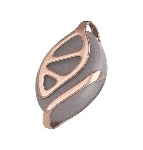
Bellabeat’s Leaf Tracker
[ ]
]
Product’s description:
“Bella Leaf is a classic wellness tracker that can be worn as a bracelet, necklace, or clip. The Leaf tracker connects to the Bellabeat app to track activity, sleep, and stress. Leaf will automatically track your night-time sleep, there is no need for you to tell the device that you are going to sleep or put it in any kind of sleep mode.” - The company.
“…At this moment, Leaf does not track heart rate…Leaf’s battery lasts up to 6 months…” - support.bellabeat.com
“Every time that you wish to see new data in your Bellabeat app, you will need to manually sync your Leaf.” - support.bellabeat.com
Fitbit Trackers
“A Fitbit is a piece of technology that people can wear around their wrist to measure their daily steps, heart rate, and more.” - medicalnewstoday.com
How Fitbit’s
“The fitness tracker’s sensor records data of accumulated steps in real-time, but the data stays local on the device. The fitness tracker will background sync the activity data to the device app on your phone (i.e. the Fitbit app) at various intervals. Background syncing usually happens between 1–20 times per day and is up to the fitness tracker and its paired app to determine how often they sync.” - movespring.com
Fitbit dataset
Data was downloaded from Fitbit Fitness Tracker Data from the Kaggle web repository.
Thirty eligible Fitbit users consented to submit personal tracker data, including minute-level output for physical activity, heart rate, and sleep monitoring. Respondents generated these datasets to a distributed survey via Amazon Mechanical Turk between 04.12.2016-05.12.2016. Individual reports can be parsed by export session ID (column A) or timestamp (column B). Variation between output represents using different Fitbit trackers and personal tracking behaviors/preferences. The scope of exploratory analysis is limited due to no metadata provided. Limitations such as the size of the data sample and needing critical information such as participants’ demographic characteristics, lifestyle, time location, weather indicators, and activity tracker usage
Data Preparation
Loading packages and libraries
Packages used: “readr”, “tidyverse”, “lubridate”, “janitor”, “dplyr”, “tidyr”, “skimr”, “ggplot2”, “openair”, “psych”, “DataExplorer”, “VennDiagram”, formattable”
Loading CSV files
Data used: Daily Activity, Hourly Steps, Hourly Calories, Hourly Intensities, Sleep Day, Heart Rate, Weight log.
Find data here.
Raw data was provided as a zip file. After being unzipped, the files were imported to RStudio as data frames and given shorter names for better viewing.
daily_activity <- read_csv(here("~/Data_Analytics/notebooks_R/Projects/GA-Class/Capstone/data2", "dailyActivity_merged.csv"))
hourly_calories <- read_csv(here("~/Data_Analytics/notebooks_R/Projects/GA-Class/Capstone/data2", "hourlyCalories_merged.csv"))
hourly_intensities<- read_csv(here("~/Data_Analytics/notebooks_R/Projects/GA-Class/Capstone/data2", "hourlyIntensities_merged.csv"))
hourly_steps <- read_csv(here("~/Data_Analytics/notebooks_R/Projects/GA-Class/Capstone/data2", "hourlySteps_merged.csv"))
sleep_day <- read_csv(here("~/Data_Analytics/notebooks_R/Projects/GA-Class/Capstone/data2", "sleepDay_merged.csv"))
heart_rate <- read_csv(here("~/Data_Analytics/notebooks_R/Projects/GA-Class/Capstone/data2", "heartrate_seconds_merged.csv"))
weight_log <- read_csv(here("~/Data_Analytics/notebooks_R/Projects/GA-Class/Capstone/data2", "weightLogInfo_merged.csv"))
Data Cleaning/Transforming
First, check if the data contains missing values with sum(is.na(df)). I found no missing values across data sets, except 65 missing values in one variable in weight_log df, but I will not dive deep into the weight log data so I will leave it there for now.
What do the data sets involve?
Let’s first take a look at these variables:
daily_activity data set has these variables: Id, ActivityDate, TotalSteps, TotalDistance, TrackerDistance, LoggedActivitiesDistance, VeryActiveDistance, ModeratelyActiveDistance, LightActiveDistance, SedentaryActiveDistance, VeryActiveMinutes, FairlyActiveMinutes, LightlyActiveMinutes, SedentaryMinutes, Calories
hourly_steps df has these variables: Id, ActivityHour, StepTotal
hourly_calories df has these variables: Id, ActivityHour, Calories
hourly_intensities df has these variables variables: Id, ActivityHour, TotalIntensity, AverageIntensity
sleep_day df has these variables: Id, SleepDay, TotalSleepRecords, TotalMinutesAsleep, TotalTimeInBed
heart_rate df has these variables: Id, Time, Value
weight_log df has these variables: Id, Date, WeightKg, WeightPounds, Fat, BMI, IsManualReport, LogId
View Our Datasets
Let’s view the first few rows of the daily_activity dataset
head(daily_activity,3)# A tibble: 3 × 15
Id Activ…¹ Total…² Total…³ Track…⁴ Logge…⁵ VeryA…⁶ Moder…⁷ Light…⁸ Seden…⁹
<dbl> <chr> <dbl> <dbl> <dbl> <dbl> <dbl> <dbl> <dbl> <dbl>
1 1.50e9 4/12/2… 13162 8.5 8.5 0 1.88 0.550 6.06 0
2 1.50e9 4/13/2… 10735 6.97 6.97 0 1.57 0.690 4.71 0
3 1.50e9 4/14/2… 10460 6.74 6.74 0 2.44 0.400 3.91 0
# … with 5 more variables: VeryActiveMinutes <dbl>, FairlyActiveMinutes <dbl>,
# LightlyActiveMinutes <dbl>, SedentaryMinutes <dbl>, Calories <dbl>, and
# abbreviated variable names ¹ActivityDate, ²TotalSteps, ³TotalDistance,
# ⁴TrackerDistance, ⁵LoggedActivitiesDistance, ⁶VeryActiveDistance,
# ⁷ModeratelyActiveDistance, ⁸LightActiveDistance, ⁹SedentaryActiveDistanceLet’s view the first few rows of the hourly_calories dataset
head(hourly_calories,3)# A tibble: 3 × 3
Id ActivityHour Calories
<dbl> <chr> <dbl>
1 1503960366 4/12/2016 12:00:00 AM 81
2 1503960366 4/12/2016 1:00:00 AM 61
3 1503960366 4/12/2016 2:00:00 AM 59Let’s view the first few rows of the hourly_intensities dataset
head(hourly_intensities,3)# A tibble: 3 × 4
Id ActivityHour TotalIntensity AverageIntensity
<dbl> <chr> <dbl> <dbl>
1 1503960366 4/12/2016 12:00:00 AM 20 0.333
2 1503960366 4/12/2016 1:00:00 AM 8 0.133
3 1503960366 4/12/2016 2:00:00 AM 7 0.117Let’s view the first few rows of the hourly_steps dataset
head(hourly_steps,3)# A tibble: 3 × 3
Id ActivityHour StepTotal
<dbl> <chr> <dbl>
1 1503960366 4/12/2016 12:00:00 AM 373
2 1503960366 4/12/2016 1:00:00 AM 160
3 1503960366 4/12/2016 2:00:00 AM 151Let’s view the first few rows of the sleep_day dataset
head(sleep_day,3)# A tibble: 3 × 5
Id SleepDay TotalSleepRecords TotalMinutesAsleep TotalT…¹
<dbl> <chr> <dbl> <dbl> <dbl>
1 1503960366 4/12/2016 12:00:00 AM 1 327 346
2 1503960366 4/13/2016 12:00:00 AM 2 384 407
3 1503960366 4/15/2016 12:00:00 AM 1 412 442
# … with abbreviated variable name ¹TotalTimeInBedQuick Observation
After a quick analysis of the datasets, I noticed that all data frames have a column labeled “Id” we will use this column to merge the datasets, much like using the “Join” function in SQL.
But First, there are a few cleaning steps to do, such as:
Drop columns that are redundant to reduce computational overhead and better viewing.
Naming variables
Formatting variables
Data Transformation
For the daily activities dataset, we will rename columns, clean up the column names by dropping redundant columns & Lastly, reorder the columns by position.
daily_activity dataset
daily <- daily_activity %>%
  clean_names() %>%
  mutate(activity_date = mdy(activity_date), day_week = weekdays(activity_date)) %>%
  rename(date = activity_date) %>%
  select(-c(5:10)) # drop redundant columns
#Reorder columns by position
daily <- daily[, c(1,2,10,3,9,4:8)]
head(daily)
# A tibble: 6 × 10
id date day_week total…¹ calor…² total…³ very_…⁴ fairl…⁵ light…⁶
<dbl> <date> <chr> <dbl> <dbl> <dbl> <dbl> <dbl> <dbl>
1 1503960366 2016-04-12 Tuesday 13162 1985 8.5 25 13 328
2 1503960366 2016-04-13 Wednesd… 10735 1797 6.97 21 19 217
3 1503960366 2016-04-14 Thursday 10460 1776 6.74 30 11 181
4 1503960366 2016-04-15 Friday 9762 1745 6.28 29 34 209
5 1503960366 2016-04-16 Saturday 12669 1863 8.16 36 10 221
6 1503960366 2016-04-17 Sunday 9705 1728 6.48 38 20 164
# … with 1 more variable: sedentary_minutes <dbl>, and abbreviated variable
# names ¹total_steps, ²calories, ³total_distance, ⁴very_active_minutes,
# ⁵fairly_active_minutes, ⁶lightly_active_minutesall hourly datasets
Next, I will merge datasets (hourly_calories, hourly_intensities, & hourly_steps) into a new data frame called hourly_activity.
hourly_activity <- hourly_calories %>%
  left_join(hourly_intensities, by = c("Id", "ActivityHour")) %>%
  left_join(hourly_steps, by = c("Id", "ActivityHour")) %>%
  clean_names() %>%
  mutate(activity_hour = mdy_hms(activity_hour),
         day_week = weekdays(activity_hour)) %>%
  separate(col = activity_hour, into  = c("date", "time"), sep = " ") %>%
  mutate(date = ymd(date)) %>%
  select(-"average_intensity")
# Reorder columns
hourly_activity <- hourly_activity[,c(1,2,7,3,6,5,4)]
head(hourly_activity)
# A tibble: 6 × 7
id date day_week time step_total total_intensity calories
<dbl> <date> <chr> <chr> <dbl> <dbl> <dbl>
1 1503960366 2016-04-12 Tuesday 00:00:00 373 20 81
2 1503960366 2016-04-12 Tuesday 01:00:00 160 8 61
3 1503960366 2016-04-12 Tuesday 02:00:00 151 7 59
4 1503960366 2016-04-12 Tuesday 03:00:00 0 0 47
5 1503960366 2016-04-12 Tuesday 04:00:00 0 0 48
6 1503960366 2016-04-12 Tuesday 05:00:00 0 0 48sleep_day dataset
From the sleep_day dataset, I will separate the SleepDay column into “Date” and ” Sleep_time” for the Sleep Day dataset. Then create a new column called day_week that contains the days of the week. Finlay rename and reorder columns.
sleep <- sleep_day %>%
  clean_names() %>%
  separate(col = sleep_day, c("date", "sleep_time"), sep = " ", extra = 'merge') %>%
  mutate(date = mdy(date),
         day_week = weekdays(date)) %>%
  rename("sleep_records" = "total_sleep_records",
        "asleep_mins" = "total_minutes_asleep",
        "bed_mins" = "total_time_in_bed") %>%
  select(-"sleep_time")
sleep <- sleep[,c(1,2,6,3,4,5)]
head(sleep)
# A tibble: 6 × 6
id date day_week sleep_records asleep_mins bed_mins
<dbl> <date> <chr> <dbl> <dbl> <dbl>
1 1503960366 2016-04-12 Tuesday 1 327 346
2 1503960366 2016-04-13 Wednesday 2 384 407
3 1503960366 2016-04-15 Friday 1 412 442
4 1503960366 2016-04-16 Saturday 2 340 367
5 1503960366 2016-04-17 Sunday 1 700 712
6 1503960366 2016-04-19 Tuesday 1 304 320heartrate dataset
For the heartrate & weight_log datasets, We need to separate the timestamp columns into two columns called “date” & “datetime”
heartrate <- heart_rate %>%
  clean_names() %>%
  mutate(time = mdy_hms(time)) %>%
  separate(col = time, into = c("date", "datetime"), sep = " ") %>%
  select(-c(datetime, value)) %>%
  group_by(id, date) %>%
  summarise(.groups = "drop")
weight log dataset
weight_log <- weight_log %>%
  clean_names() %>%
  mutate(date = mdy_hms(date)) %>%
  separate(col = date, into = c("date", "datetime"), sep = " ") %>%
  mutate(date = ymd(date))
Now that all date data is cleaned, we can see min(date) and max(date), and n_unique(df\$id) for each data frame:
daily_activity data available for 2016-04-12 and 2016-05-12 with 33 unique IDs.
hourly_activity data available for 2016-04-12 and 2016-05-12 with with 33 unique Ids.
sleep data available for 2016-04-12 and 2016-05-12 with with 24 unique Ids.
heartrate data available for 2016-04-12 and 2016-05-12 with with 14 unique Ids.
weight_log data available for 2016-04-12 and 2016-05-12 with with 8 unique Ids.
Data Exploration
You can see a significant discrepancy in the number of unique Ids in steps count, sleep tracking, heart rate monitor, and weight management data. Let’s visualize the intersection of user Ids based on these data points.
# Generate 4 sets of unique Ids for each feature.
step_ids <- unique(daily$id, incomparables = FALSE)
sleep_ids <- unique(sleep$id, incomparables = FALSE)
heartrate_ids <- unique(heartrate$id, incomparables = FALSE)
weight_ids <- unique(weight_log$id, incomparables = FALSE)
# Plot
venn <- venn.diagram(x = list(step_ids, sleep_ids, heartrate_ids, weight_ids),
  category.names = c("Steps count", "Sleep monitor", "Heart monitor", "Weight tracking"),
  filename = "datapoint_venn.png",
  output=TRUE, imagetype="png",
  lwd = 2, fill = c("skyblue", "red", "black", "orange"),
  cex = 1, fontface = "bold", fontfamily = "sans",
  cat.cex = .7, cat.fontface = "bold", cat.default.pos = "outer", cat.fontfamily = "sans")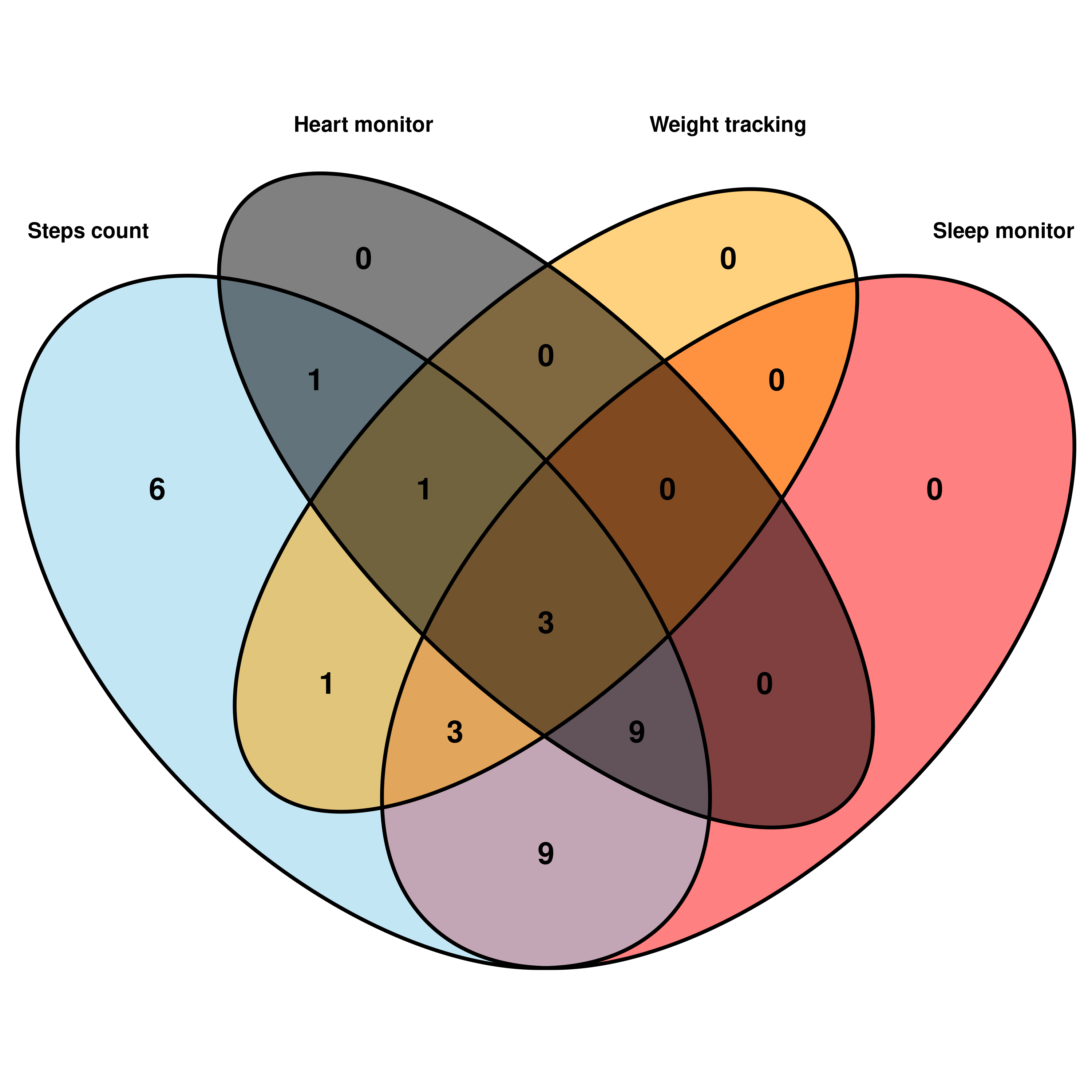
This Venn Diagram shows that among a total of 33 Ids (100%), there are: Multi-feature users:
100% (33 Ids) have STEPS count records (combined with or without other features)
73% (24 Ids) have STEPS count and SLEEP tracking records (this subgroup is reasonably close to that of Bellabeat’s users)
42% (14 Ids) have STEPS count and HEARTRATE monitoring records
24% (8 Ids) have STEPS count and WEIGHT tracking records
9% (3 Ids) have all four featured records of STEPS - SLEEP - HEARTRATE - WEIGHT
Of which:
Single-feature records or users:
- 18% (6 Ids) have only STEPS count records (no other features used)
Duo-feature users:
27% (9 Ids) have only a duo-feature of STEPS - SLEEP records (This subgroup is the closest one to that of Bellabeat’s Leaf users as purely recorded Steps - Sleep)
One id has only the duo feature of STEPS - WEIGHT record.
One id has a duo feature of STEPS - HEARTRATE record.
Trio_feature users:
27% (9 ids) used three features of STEPS - SLEEP - HEARTRATE
9% (3 ids) used three features of STEPS - SLEEP - WEIGHT
One id used trio-feature STEPS - HEARTRATE - WEIGHT
Features with 0 users:
0 Id used only HEARTRATE or WEIGHT or SLEEP feature alone
0 Id used superior duo features of HEARTRATE - WEIGHT or SLEEP - WEIGHT or HEARTRATE - SLEEP
For the remaining Data analysis, I will focus on the group that had 24 ids, as this subgroup is close to that of Bellabeat’s users.
Check which IDs have both STEPS and SLEEP records:
sleep_ids[sleep_ids %in% step_ids] [1] 1503960366 1644430081 1844505072 1927972279 2026352035 2320127002
[7] 2347167796 3977333714 4020332650 4319703577 4388161847 4445114986
[13] 4558609924 4702921684 5553957443 5577150313 6117666160 6775888955
[19] 6962181067 7007744171 7086361926 8053475328 8378563200 8792009665Steps and Sleep tracking are the main features of Bellabeat’s Leaf measure. Now we will join these two data frames for an in-and-out view.
Create a new data frame
# Merge the two dfs
step_sleep <- merge(daily, sleep, by = c("id", "date", "day_week"))
# Remove and duplicates after merging dfs need to remove
step_sleep <- step_sleep[!duplicated(step_sleep), ]
# Check data
head(step_sleep)
id date day_week total_steps calories total_distance
1 1503960366 2016-04-12 Tuesday 13162 1985 8.50
2 1503960366 2016-04-13 Wednesday 10735 1797 6.97
3 1503960366 2016-04-15 Friday 9762 1745 6.28
4 1503960366 2016-04-16 Saturday 12669 1863 8.16
5 1503960366 2016-04-17 Sunday 9705 1728 6.48
6 1503960366 2016-04-19 Tuesday 15506 2035 9.88
very_active_minutes fairly_active_minutes lightly_active_minutes
1 25 13 328
2 21 19 217
3 29 34 209
4 36 10 221
5 38 20 164
6 50 31 264
sedentary_minutes sleep_records asleep_mins bed_mins
1 728 1 327 346
2 776 2 384 407
3 726 1 412 442
4 773 2 340 367
5 539 1 700 712
6 775 1 304 320nrow(step_sleep)[1] 410n_unique(step_sleep$id)[1] 24Now let’s take a review our new data frame.
step_sleep %>% select(-c("id", "sleep_records")) %>% plot_histogram(ncol = 3, ggtheme = theme_light())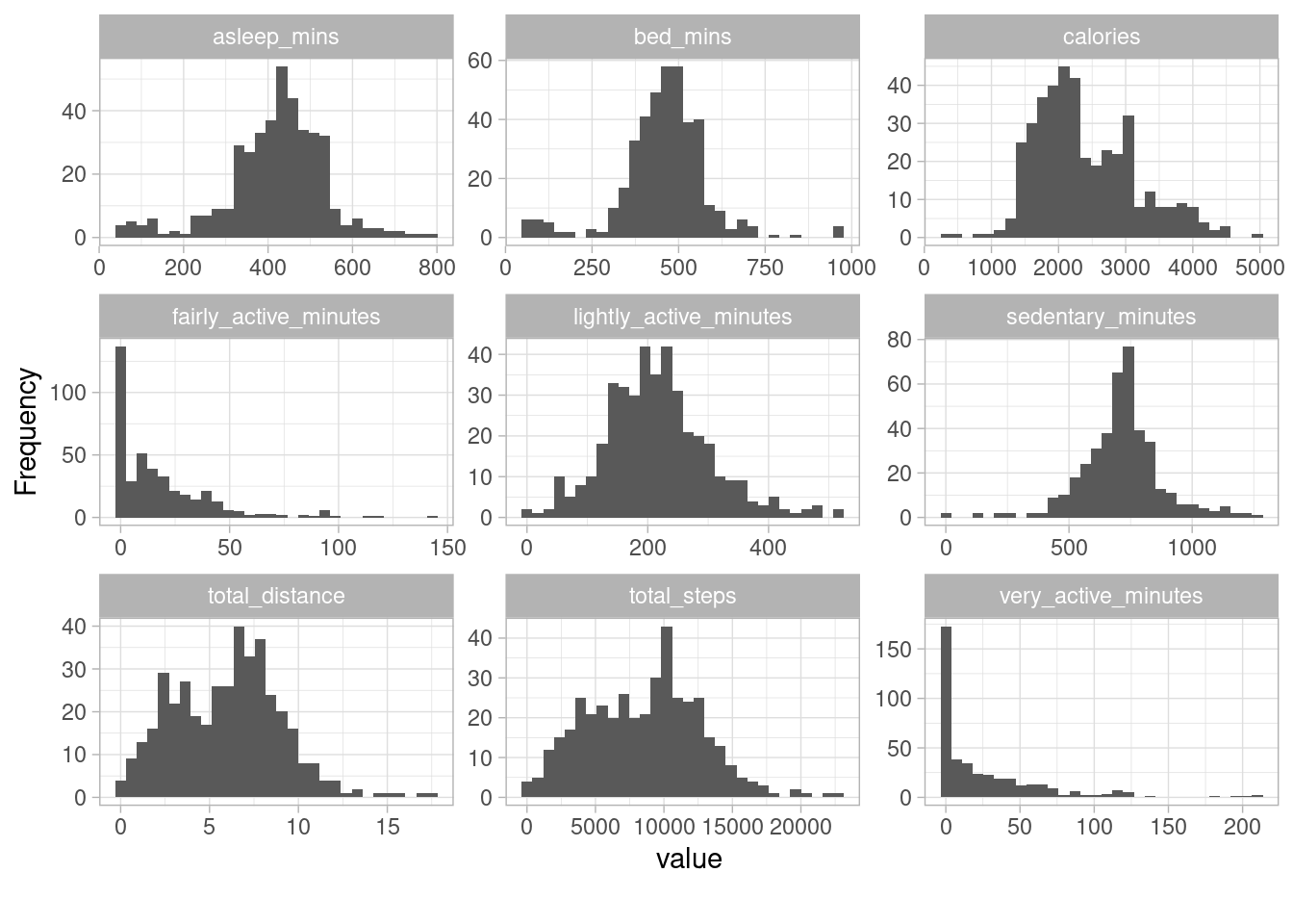
options(repr.plot.width = 20, repr.plot.height = 8)Data Credibility
“Asleep minutes,” “bed-stay minutes,” “lightly minutes,” and “sedentary minutes” are variables that have peaked bars with most of the values bunched up in the middle of the histograms, with few values spread along both the right and left tails might reveal some potential inaccuracies - potentially due to improper wearable usage. For example, users might not change sleep sensitivity settings, or there may be a battery issue. The “Total steps” variable has a peak bar with the distribution mass concentrated in the middle of the figure and a few values spread over the right tail. This tells us that the data points are not normally distributed. In addition, the plot reveals the presence of a few extreme values in the lower right bound of the plot. This could be a measurement error (e.g., the possibility of false “hand” steps when wrist-worn) - but it could also be when users took extra exercises on those particular days. “Very active minutes” and “fairly active minutes” are positively skewed, with most data points clustered on the left side, mainly at zero value. There are also a few outliers in the right bound with values greater than 100 mins. This could be a technical error when a device doesn’t sync to the user’s phone app - one of the many tracking issues, according to Fitbit Community or that users didn’t perform any exercise in those days.
Analyze and Visualize
Primary question:
#### What are some trends in smart device usage? *** That question is too vague; I will break this question down into two more straightforward questions:
Q. What is smart device usage by features?
As illustrated in Venn Diagram of features used by users in the sample.
Q. Is there any trend in daily usage?
Let’s first gather few ideas into how users spent their steps at a day level. This calendar-based map illustrates the average steps taken per user by each day in the given period. Through the heat map, we can easily look over the frequency of steps by each day and users’ daily rhythms may reveal. #### Trend in daily usage
# Get number of users used their devices each day:
obs_users <- step_sleep %>% group_by(date) %>%
  summarise(user_perday = sum(n()), .groups = "drop")
#Plot a calendar heat map on total steps by day
calendarPlot(obs_users, pollutant = "user_perday", year = 2016, month = 4:5,  cex.lim = c(0.6, 1), main = "Number of Users Used Devices by Day", cols="increment", key.header = "Number of Users", key.position = "top")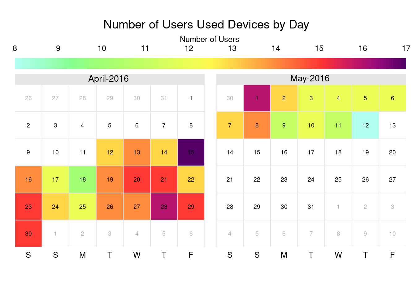
options(repr.plot.width = 14, repr.plot.height = 10)Summary of users per day
# Summary of users per day
summary(obs_users$user_perday)
Min. 1st Qu. Median Mean 3rd Qu. Max.
8.00 12.00 13.00 13.23 14.50 17.00 Daily usage at first glance:
Within 31 days of data being recorded, we can still see a few interesting points here:
Of 24 Ids (100%), the number of users who used their devices daily can vary from as little as 33% (8 users) to as many as 71% (17 users) each day. The most significant number of users per day is around double that of the least number of users per day.
Participants used their devices more frequently in the first half of the period than days toward the end.
obs_users <- step_sleep %>% group_by(date) %>%
  summarise(user_perday = sum(n()), .groups = "drop") %>%  arrange(user_perday)
head(obs_users)
# A tibble: 6 × 2
date user_perday
<date> <int>
1 2016-05-12 8
2 2016-04-18 10
3 2016-05-09 11
4 2016-05-11 11
5 2016-04-17 12
6 2016-04-25 12Get number of days a user used their device in a 31 day period
# Get number of days a user used their device in a 31 day period:
obs_days <- step_sleep %>% group_by(id) %>%
  summarise(num_dayuse = sum(n()), .groups = "drop") %>%
  arrange(-num_dayuse)
summary(obs_days$num_dayuse)
Min. 1st Qu. Median Mean 3rd Qu. Max.
1.00 4.75 20.50 17.08 27.25 31.00 Classify users into usage ranges
# Classify users into usage ranges
usage <- obs_days %>%
  mutate(group = case_when(
    between(num_dayuse, 1, 10) ~ "low usage",
    between(num_dayuse, 11, 20) ~ "moderate usage",
    between(num_dayuse, 21, 31) ~ "high usage",
    TRUE ~ NA_character_
    ))
# Create a df with new attributes
usage_df <- step_sleep %>%
  left_join(usage, by = "id")
# Compute percentage of each usage groups
sum_usage <- usage %>%
  mutate(group = fct_relevel(group, c("high usage", "moderate usage", "low usage"))) %>%
  group_by(group) %>%
  summarise(num_users = n()) %>%
mutate(percent = num_users/sum(num_users)*100)formattable(sum_usage, list(percent = color_bar("yellow")))| group | num_users | percent |
|---|---|---|
| high usage | 12 | 50.0 |
| moderate usage | 3 | 12.5 |
| low usage | 9 | 37.5 |
In general, users only wore their devices on a day in day out basis. Although after observing the number of days each user wore their fitness tracker (or had data on that day), I have noticed that, surprisingly, some users would keep their devices daily or almost every day (n = 27 ~ 31 days). In contrast, only a few used their devices for just a few days, and others reached the average number of days in the recording period.
Stats:
50% of users who used their devices frequently on a nearly day-in-day-out basis (on a
21-31day scale),12% of users who moderately used their devices (on an
11-20day scale),38% of users who used their devices least frequently (on a
1-10day scale)
Now I want to know how these different groups of users responded to using fitness trackers. Therefore, I divided users into three groups based on their usage levels: high, moderate, and low usage from this point onward.
Q. Trends on performances among groups?
Active levels comparison
# Summarise Active minutes by days
active1 <- usage_df %>%
  group_by(group) %>%
  summarise(very_active = round(mean(very_active_minutes),0),
            fairly_active = round(mean(fairly_active_minutes),0), .groups = "drop")
# Reshape data
active1_long <- gather(data = active1, key = "variables", value = "value", -group)
# Plot very active and fairly active minutes per day
active1_long %>%
  ggplot()+ geom_col(aes(x= group, y=value, group=variables, fill=variables))+
  theme(axis.text.x = element_text(size = 9))+
  labs(x="Group of users" , y="Minutes")+
  ggtitle("Comparison of Average Active Minutes")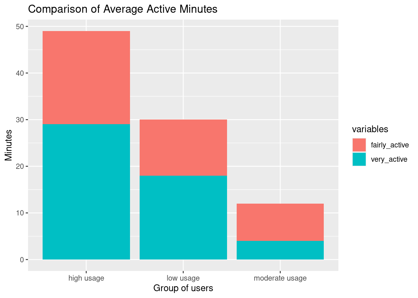
options(repr.plot.width = 8, repr.plot.height = 5)The users who exercised frequently performed more vigorously/intensively with the longest active minutes. However, users who had the least days of exercising spent longer time exercising than those who had a medium number of days of performing.
Average activities on a daily scale
# Get data for average activities on a daily scale
usage_hr <- usage_df %>% group_by(group, date, id, day_week) %>%
  mutate(total_mins = sum(very_active_minutes, fairly_active_minutes, lightly_active_minutes, bed_mins)) %>%   summarise(steps = round(mean(total_steps),0),
            distance = round(mean(total_distance),0),
    very_active = round(mean(very_active_minutes),0),
            fairly_active = round(mean(fairly_active_minutes),0),
            lightly_active = round(mean(lightly_active_minutes),0),
            sedentary_hr = round(mean(sedentary_minutes)/60,2),
            bed_hr = round(mean(bed_mins)/60,2),
            asleep_hr = round(mean(asleep_mins)/60,2),
            avg_hr = round(sum(very_active, fairly_active, lightly_active, sedentary_minutes, bed_mins)/60,2), .groups = "drop")
head(usage_hr)
# A tibble: 6 × 13
group date id day_w…¹ steps dista…² very_…³ fairl…⁴ light…⁵ seden…⁶
<chr> <date> <dbl> <chr> <dbl> <dbl> <dbl> <dbl> <dbl> <dbl>
1 high … 2016-04-12 1.50e9 Tuesday 13162 8 25 13 328 12.1
2 high … 2016-04-12 2.03e9 Tuesday 4414 3 3 8 181 11.8
3 high … 2016-04-12 3.98e9 Tuesday 8856 6 44 19 131 13.0
4 high … 2016-04-12 4.45e9 Tuesday 3276 2 0 0 196 13.1
5 high … 2016-04-12 4.70e9 Tuesday 7213 6 0 0 263 12.0
6 high … 2016-04-12 5.55e9 Tuesday 11596 8 19 13 277 12.8
# … with 3 more variables: bed_hr <dbl>, asleep_hr <dbl>, avg_hr <dbl>, and
# abbreviated variable names ¹day_week, ²distance, ³very_active,
# ⁴fairly_active, ⁵lightly_active, ⁶sedentary_hrCompare user groups by their average very_active minutes
box plot
# Summarise Active minutes by groups
active <- usage_hr %>%
group_by(group, id) %>%
summarise(very_active = round(mean(very_active),0),
fairly_active = round(mean(fairly_active),0),
.groups = "drop")
# Reshape data
active_long <- gather(data = active, key = "variables", value = "value", -c(group, id))
# Plot data
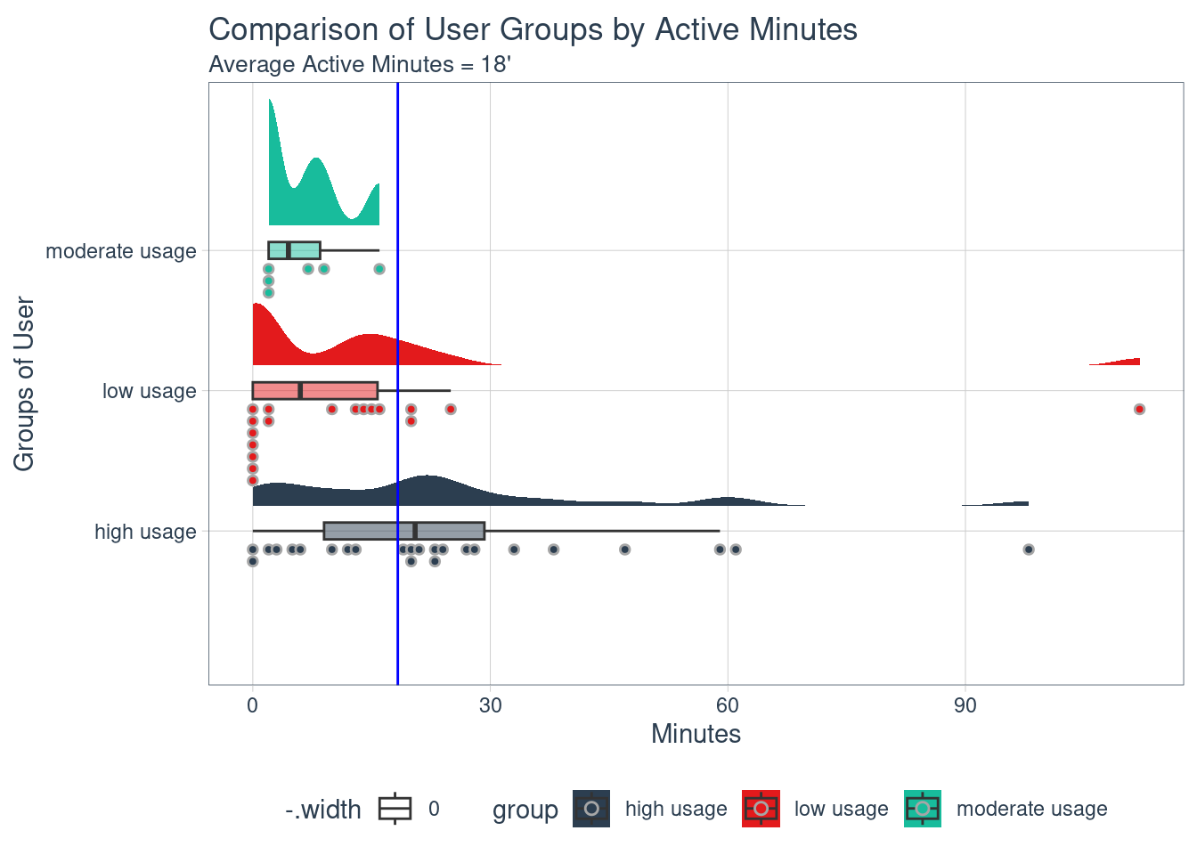
ggplot(active_long, aes(group, value, fill=group))+
geom_boxplot(show.legend = TRUE)+
geom_hline(yintercept = mean(active_long$value), color = "blue")+
xlab("Groups of User") + ylab("Minutes") +
ggtitle("Comparison of User Groups by Active Minutes", "Average Active Minutes = 18'")+
theme(axis.text.x=element_blank(), axis.ticks.x=element_blank())+
theme(legend.position = "top")+
facet_wrap(~variables)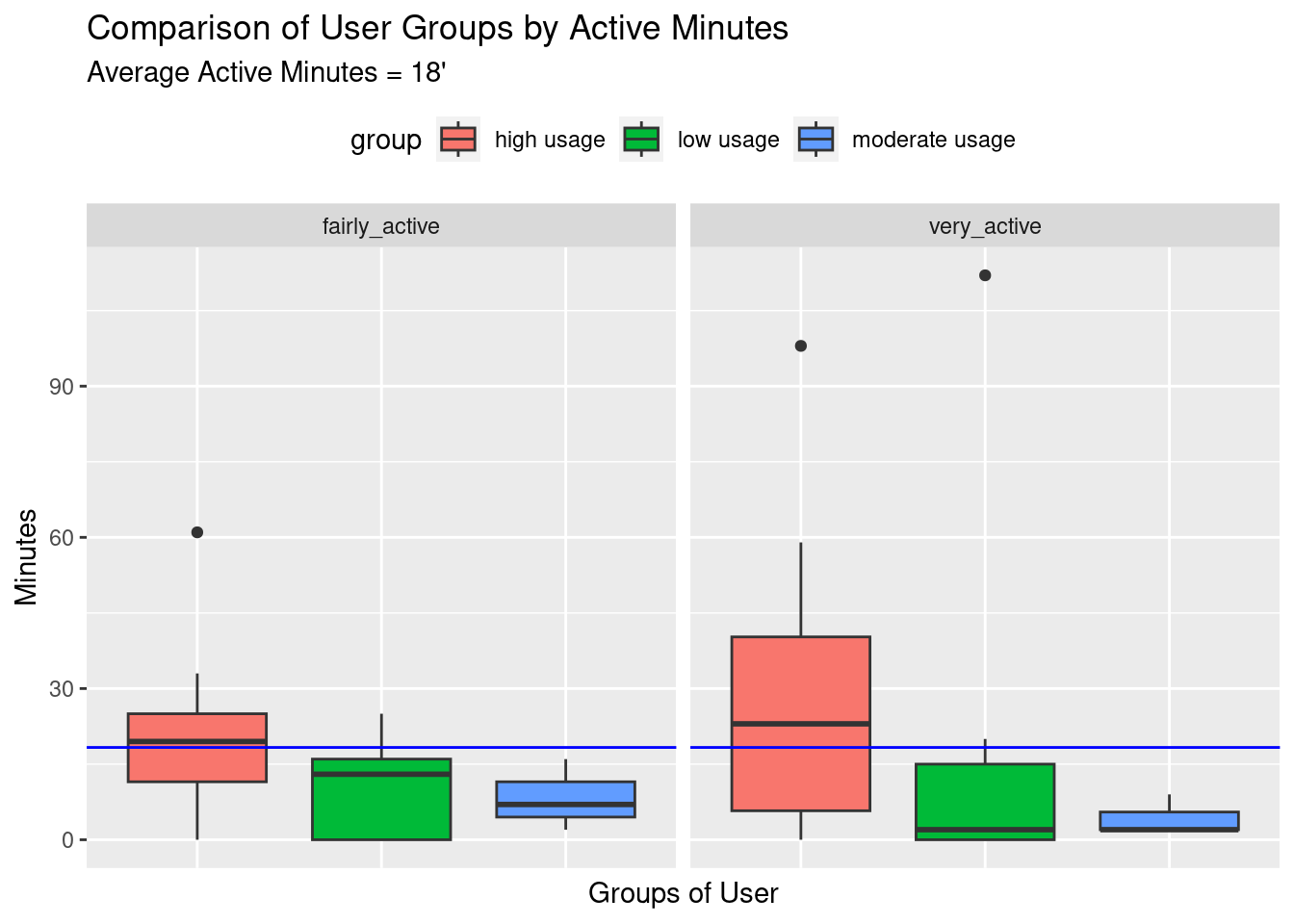
options(repr.plot.width = 12, repr.plot.height = 6)raincloud plot
List of 5
 $ axis.text.x     : list()
  ..- attr(*, "class")= chr [1:2] "element_blank" "element"
 $ axis.ticks.x    : list()
  ..- attr(*, "class")= chr [1:2] "element_blank" "element"
 $ legend.position : chr "top"
 $ repr.plot.width : num 12
 $ repr.plot.height: num 6
 - attr(*, "class")= chr [1:2] "theme" "gg"
 - attr(*, "complete")= logi FALSE
 - attr(*, "validate")= logi TRUE
Compare to an average number of 18 active minutes, similarly to previous observations, the high usage group is the best-performer in both intensity levels. We can also see from the boxplot there are few users with an extremely high amount of time in both high and low usage groups.
Active minutes among groups based on days of the week
# Summarise Active minutes by days
active2 <- usage_df %>%
  group_by(day_week, group) %>%
  summarise(very_active = round(mean(very_active_minutes),0),
            fairly_active = round(mean(fairly_active_minutes),0),.groups = "drop")
# Reshape data
active2_long <- gather(data = active2, key = "variables", value = "value", -c(group,day_week))
# Plot data
active2_long %>% mutate(day_week = fct_relevel(day_week,c("Sunday", "Monday", "Tuesday", "Wednesday", "Thursday", "Friday", "Saturday"))) %>%
  ggplot()+ geom_col(aes(x= day_week, y=value, fill=variables))+
  theme(axis.text.x = element_text(size = 11, angle = 60, hjust = 1, vjust = 1))+
  theme(legend.position = "top")+
  labs(x="Days" , y="Minutes")+
  ggtitle("Comparison of Active Mins", "By Groups, Days and Levels")+
  facet_grid(variables~group)
options(repr.plot.width = 14, repr.plot.height = 6)Users in the High usage group regularly exercise daily on workdays and weekends, particularly more intense at the beginning of the week (Mons-Tues) and slightly more on Saturdays.
Low and moderate usage groups of users don’t follow any particular routine of performing.
Low active and Inactive comparison among groups
lightly <- usage_hr %>%
  group_by(group, id) %>%
  summarise(lightly_hr = round(mean(lightly_active)/60,2),.groups = "drop")
low_ints <- usage_hr %>%
  group_by(group, id) %>%
  summarise(lightly_hr = round(mean(lightly_active)/60,2),
            sedentary_hr = round(mean(sedentary_hr),0), .groups = "drop")
# Reshape data
low_ints_long <- gather(data = low_ints, key = "variables", value = "value", -c(group, id))
# Plot lightly active minutes per day
ggplot(low_ints_long, aes(group, value, fill=group))+
  geom_boxplot(show.legend = TRUE)+
  xlab("Groups of Users") + ylab("Hours") +
  ggtitle("Comparison by Lightly Active / Sedentary Hours")+
   theme(axis.text.x=element_blank(),axis.ticks.x=element_blank())+
  facet_wrap(~variables)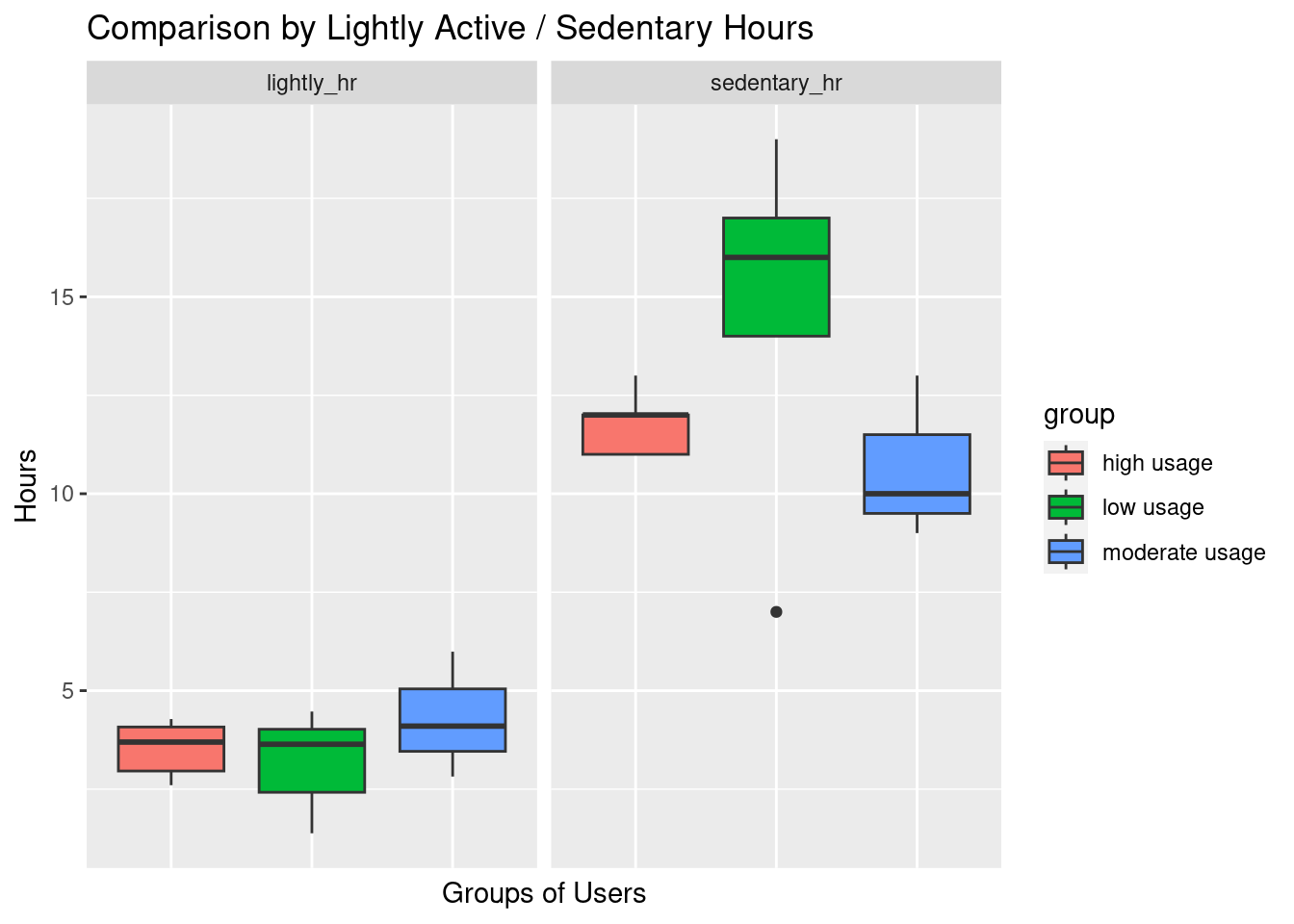
options(repr.plot.width = 14, repr.plot.height = 8)Moderate usage group tends to spend most hours in low active activities and least sedentary hours than other groups.
Those users who used their devices least days had the longest number of sedentary hours. #### Summarise Low active and Inactive minutes by days
# Summarise Low active and Inactive minutes by days
low_act <- usage_df %>%
  group_by(day_week, group) %>%
  summarise(lightly_active = round(mean(lightly_active_minutes)/60,0),
            sedentary = round(mean(sedentary_minutes)/60,0),.groups = "drop")
# Reshape data
lowact_long <- gather(data = low_act, key = "variables", value = "value", -c(group,day_week))
# Plot very active and fairly active minutes per day
lowact_long %>% mutate(day_week = fct_relevel(day_week,c("Sunday", "Monday", "Tuesday", "Wednesday", "Thursday", "Friday", "Saturday"))) %>%
ggplot()+ geom_col(aes(x= day_week, y=value, group=variables, fill=group))+
  theme(axis.text.x = element_text(size=11, angle = 60, hjust = 1, vjust = 1))+
  labs(x="Days" , y="Hours")+
  ggtitle("Comparison of Low and Inactive Hours", "By Groups, Days and Levels")+
  facet_grid(variables~group)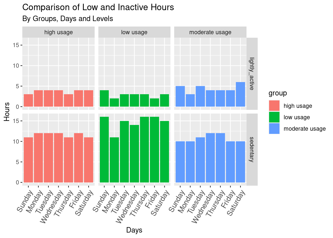
options(repr.plot.width = 14, repr.plot.height = 8)High usage group: spent up their light activity hours and inactive hours during workdays and being less active during the weekend.
The low usage group has the most inactive hours of the three.
Moderate users tend to be most lightly active over the weekend.
Rest hours comparison among groups
# Summarise bed-rest hours by days
vars <- usage_hr %>%
  group_by(group, id) %>%
  summarise(bed_hr = round(mean(bed_hr),0), asleep_hr = round(mean(asleep_hr),0), .groups = "drop")
# Reshape data
vars_long <- gather(data = vars, key = "variables", value = "value", -c(group, id))
# Plot very active and fairly active minutes per day
ggplot(vars_long, aes(group, value, fill=group))+
  geom_boxplot(show.legend = TRUE)+
  geom_hline(yintercept = mean(vars_long$value), color = "blue")+
  xlab("Groups of Users") + ylab("Hours") +
  ggtitle("Comparison by Bed-rest Hours", "Average Bed-rest Hours = 6.6")+
   theme(axis.text.x=element_blank(), axis.ticks.x=element_blank())+
  facet_grid(~variables)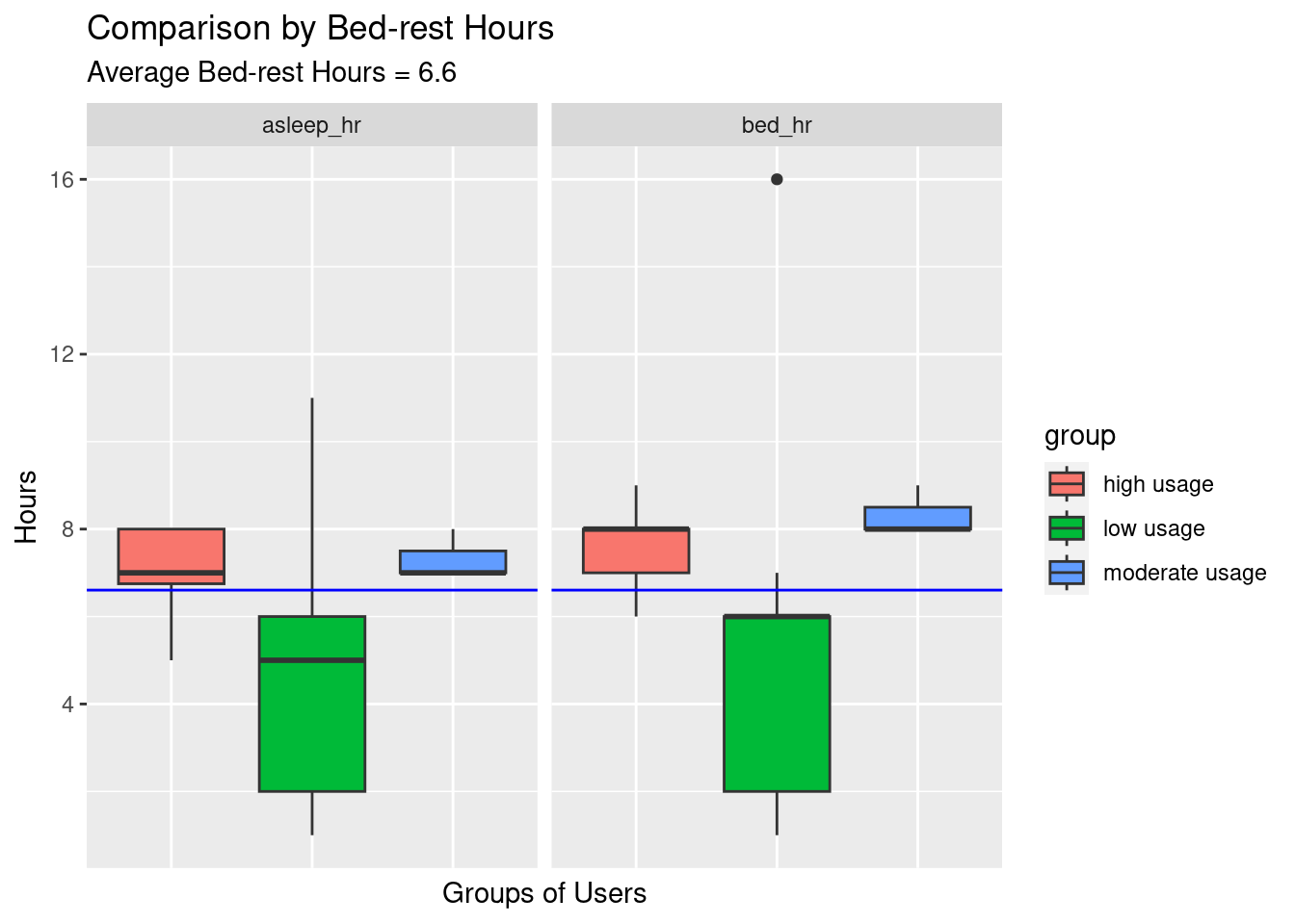
options(repr.plot.width = 14, repr.plot.height = 6)The low usage group had their sleep hours and rest hours varied the most (between 2-6 hours) and tended to have a night of insufficient sleep, while the high and moderate usage groups steadily stuck with their bed routine and had sufficient rest.
# Summarise Rest Hours by days
rest <- usage_df %>%
  group_by(day_week, group) %>%
  summarise(sleep = round(mean(asleep_mins)/60,0),
            bed_stay = round(mean(bed_mins)/60,0),.groups = "drop")
# Reshape data
rest_long <- gather(data = rest, key = "variables", value = "value", -c(group,day_week))
# Plot very active and fairly active minutes per day
rest_long %>% mutate(day_week = fct_relevel(day_week,c("Sunday", "Monday", "Tuesday", "Wednesday", "Thursday", "Friday", "Saturday"))) %>%
  ggplot()+ geom_col(aes(x= day_week, y=value, group=variables, fill=variables))+
  theme(axis.text.x = element_text(size=11, hjust = 1, vjust = 1, angle = 60))+
  theme(legend.position = "bottom")+
  labs(x="Days" , y="Hours")+
  ggtitle("Comparison of Sleep and Bed-stay Hours", "By Groups and Days")+
  facet_grid(variables~group)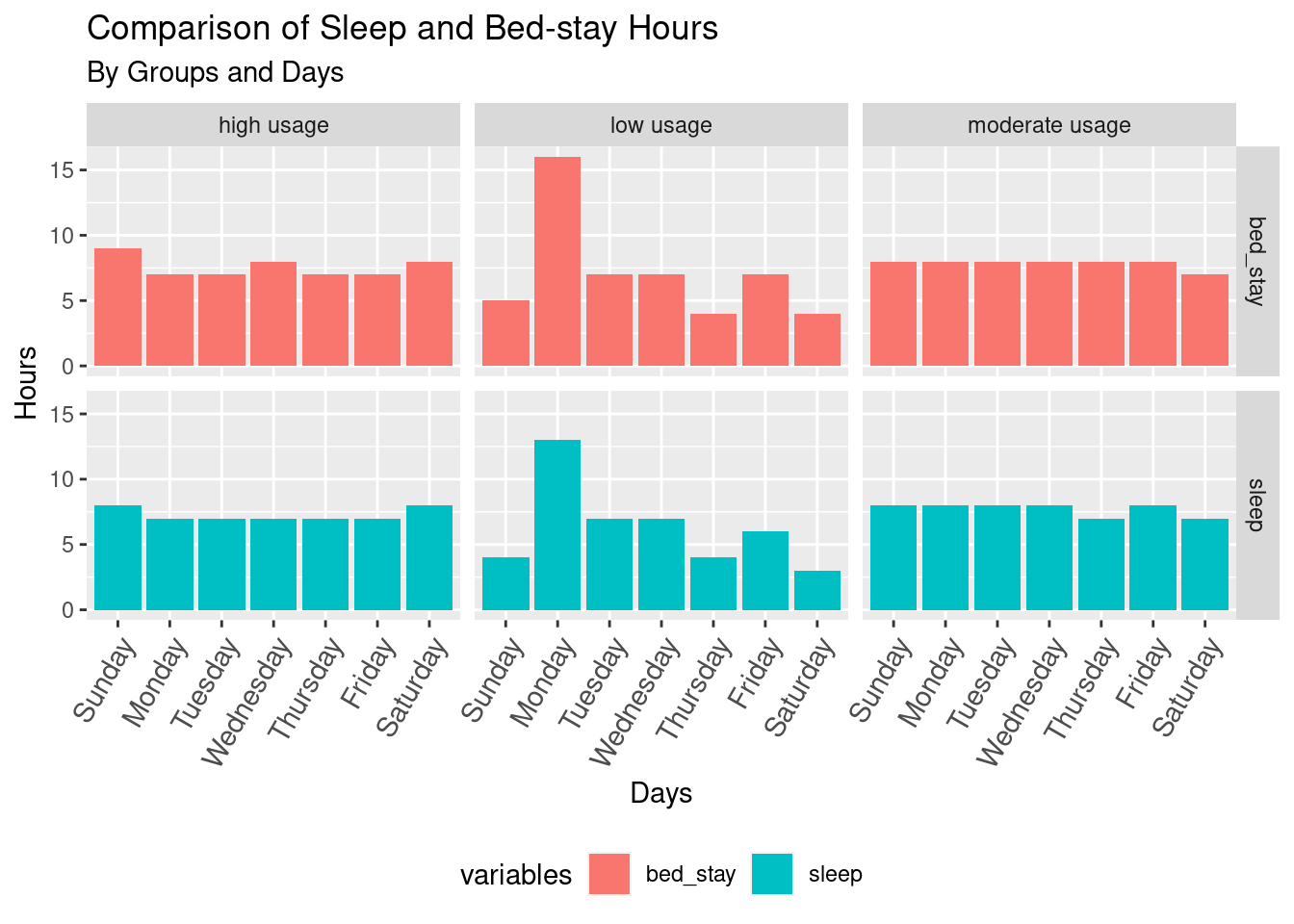
options(repr.plot.width = 14, repr.plot.height = 10)Users in high and moderate device usage groups have a regular pattern and bedtime routine; high-usage users tend to have longer hours of sleep/bed rest over weekends. The low-usage group doesn’t follow any particular sleep pattern.
Q. What Are the Average Steps Per Hour for Different Groups?
Which hour contributes more to overall performance? Let’s look at our hourly data.
Merging hourly data to daily step/sleep data
# Merging hourly data to daily step/sleep data
step_sleephour <- merge(hourly_activity, usage_df, by = c("id", "date", "day_week"))
# Remove Replicates if any
step_sleephour <- step_sleephour[!duplicated(step_sleephour), ]
# Check data
head(step_sleephour,3)
id date day_week time step_total total_intensity calories.x
1 1503960366 2016-04-12 Tuesday 12:00:00 253 11 73
2 1503960366 2016-04-12 Tuesday 19:00:00 558 39 104
3 1503960366 2016-04-12 Tuesday 07:00:00 0 0 47
total_steps calories.y total_distance very_active_minutes
1 13162 1985 8.5 25
2 13162 1985 8.5 25
3 13162 1985 8.5 25
fairly_active_minutes lightly_active_minutes sedentary_minutes sleep_records
1 13 328 728 1
2 13 328 728 1
3 13 328 728 1
asleep_mins bed_mins num_dayuse group
1 327 346 25 high usage
2 327 346 25 high usage
3 327 346 25 high usagenrow(step_sleephour)[1] 9699n_unique(step_sleephour$id)[1] 24## prepare data
stephr_gr <- step_sleephour %>%
mutate(hr = format(parse_date_time(as.character(time), "HMS"), format = "%H:%M"),
day_week = fct_relevel(day_week,
c("Sunday", "Monday", "Tuesday", "Wednesday", "Thursday", "Friday", "Saturday"))) %>%
group_by(hr, day_week, group) %>%
summarise(steps = mean(step_total), .groups = "drop")
# Plot distribution
stephr_gr <- ggplot(stephr_gr, aes(x=hr, y=steps, fill = steps))+
scale_fill_gradient(low = "green", high = "red")+
geom_bar(stat = 'identity', show.legend = TRUE) +
coord_flip() +
ggtitle("Steps By Hours", "All user groups") +
xlab("Hour") + ylab("Steps") +
theme(axis.text.x = element_text(size=6), axis.text.y = element_text(size=5))+
theme(legend.position = "top")+
facet_grid(group~day_week)
options(repr.plot.width = 14, repr.plot.height = 10)
stephr_gr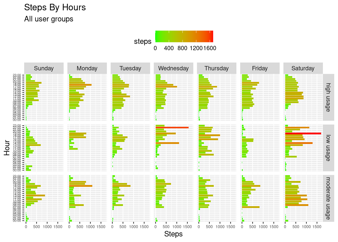
The frequent user’s group has a step/hour/day routine; this group tends to be most steady at taking steps across days of the week, slightly more steps on Saturdays compared to workdays, and least steps on Sundays expected as a rest day. The hours when this group took the majority of actions are between 8:00 - 20:00, with peaks between 17:00-19:00 for the evening.
The frequent low group doesn’t follow any particular step/hour/day routine. There are certain hours with a specific, extremely high number of steps taken (e.g., at 22:00 on a Wednesday).
The moderate user group had a bit of an intersection of high and low frequent user characteristics: steps are taken quite symmetrically by date and time across days of the week though there is no straightforward “certain hour” routine of how they would schedule their exercising activity.
Saturday is when both Low and Moderate users took the most steps on this day.
Saturday is a good day for exercise and being favored by all groups.
Q. What Are the Average Intensity Levels Per Hour for Different Groups?
# prepare data
intshr_gr <- step_sleephour %>%
  mutate(hr = format(parse_date_time(as.character(time), "HMS"), format = "%H:%M"),
        day_week = fct_relevel(day_week,
                  c("Sunday", "Monday", "Tuesday", "Wednesday", "Thursday", "Friday", "Saturday"))) %>%
  group_by(hr, day_week, group) %>%
  summarise(level = mean(total_intensity), .groups = "drop")
# Plot distribution
intshr_gr <- ggplot(intshr_gr, aes(x = hr, y = level, fill = level))+
  scale_fill_gradient(low = "yellow", high = "purple")+
  geom_bar(stat = 'identity', show.legend = TRUE) +
  coord_flip() +
  ggtitle("Intensity Levels By Hours", "All user groups") +
  xlab("Hour") + ylab("Intensity levels") +
  theme(axis.text.x = element_text(size=6),axis.text.y = element_text(size=5))+
  theme(legend.position = "top")+
  facet_grid(group~day_week)
options(repr.plot.width = 14, repr.plot.height = 10)
intshr_gr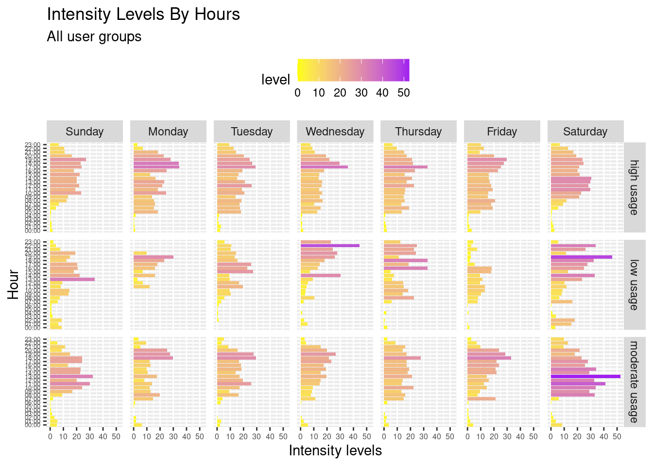
Similarly to previous observations, high-intensity hours are clustered in the evening, proving the asymmetric distribution of the values at similar hours during weekdays. However, there are a few interesting points to note after observing intensity level data:
Frequent users would keep the same intensive level throughout the week, with little to no significant difference in their intensity levels between workdays and weekends. However, they may have more hours exercising on a Saturday compared to the rest of the week.
Again, low and moderate frequent users did not have a particular intensity hour.
Q. What is the combined effect of other variables on total steps taken? i.e., very active, fairly active, lightly active, and even sedentary.
Let’s check correlations of these variables based on groups
Plot correlogram for “high usage” group
# Plot correlogram for "high usage" group
high_usage <- subset(usage_df, group=="high usage")
high_corr <- high_usage %>% select(-c(1:3, 11, 14, 15)) %>%
rename(steps = total_steps,
    distance = total_distance,
    fairly = fairly_active_minutes,
         very_active = very_active_minutes,
         lightly = lightly_active_minutes,
         sedentary = sedentary_minutes,
    asleep = asleep_mins,
    bedstay = bed_mins)
pairs.panels(high_corr, pch=20, main="Correlation in Frequent Usage Group")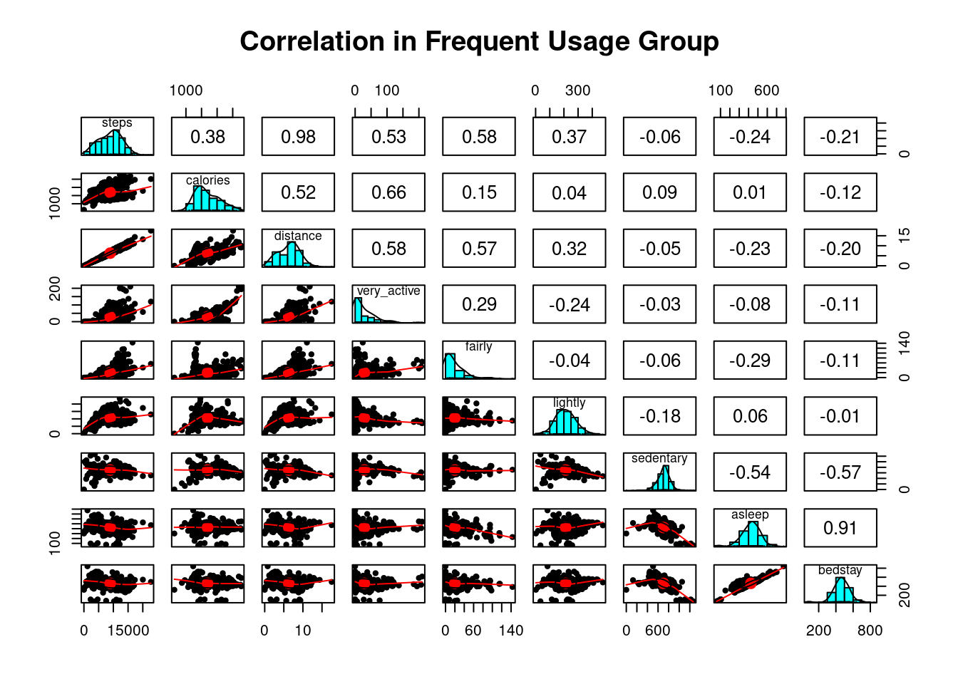
options(repr.plot.width = 14, repr.plot.height = 10)High Usage Group: Correlogram explained
The correlogram shows that frequent users of intelligent tracking devices exercise and whose physical exercise choices vary the most: from vigorous, moderate forms of exercise to light conditions such as brisk walking.
However, calories burned most during vigorous exercises for users in this group are due to the majority of steps during high or moderate-intensity activity levels. The number of calories burned is not necessarily proportional to the number of steps run or walk, implicating that frequent users may have taken different forms of physical exercise.
What predicts the number of steps per user in this group?: More steps are generated per user in this frequent usage group when people perform longer moderate-intensity or vigorous physical activities.
## Subset and Plot correlation for "moderate usage" group
moderate_usage <- subset(usage_df, group=="moderate usage")
moderate_corr <- moderate_usage %>% select(-c(1:3, 11, 14, 15)) %>%
rename(steps = total_steps,
    distance = total_distance,
    fairly = fairly_active_minutes,
         very_active = very_active_minutes,
         lightly = lightly_active_minutes,
         sedentary = sedentary_minutes,
    asleep = asleep_mins,
    bedstay = bed_mins)
pairs.panels(moderate_corr, pch=20, main="Correlation in Moderate Usage Group")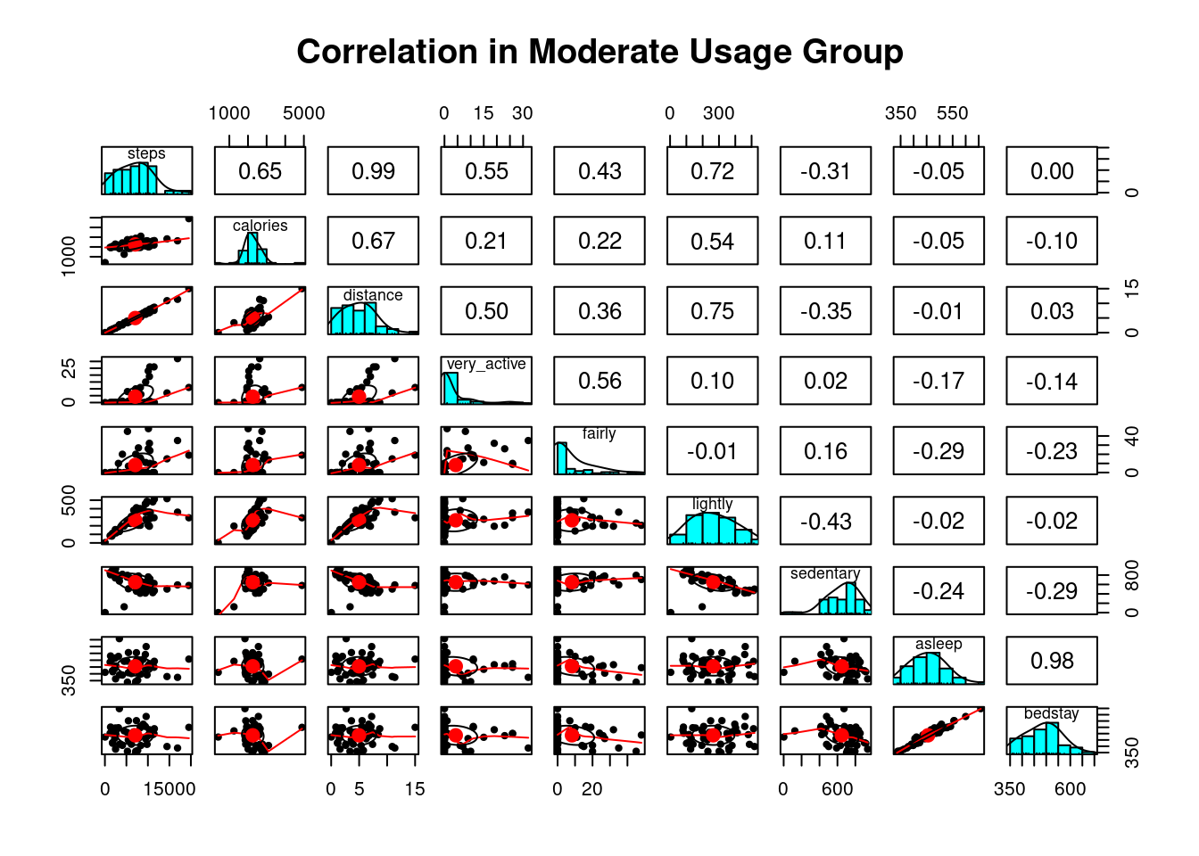
options(repr.plot.width = 14, repr.plot.height = 10)Moderate Usage Group: Correlogram explained
The correlogram shows how the total number of steps walked was affected by other variables. It is most noticeable in light active activity: lightly active is a distinct factor contributing towards the number of steps and distance for this group. More calories are burned for users in this group when they take a long brisk walk (for example, during work/study commute and shopping).
What predicts the number of steps per user in this group?: More steps are generated per user in this moderate usage group: when people take longer lightly active activities (for example, work/study commute, shopping.)
## Subset and Plot correlation for "low usage" group
low_usage <- subset(usage_df, group=="low usage")
low_corr <- low_usage %>% select(-c(1:3, 11, 14, 15)) %>%
rename(steps = total_steps,
    distance = total_distance,
    fairly = fairly_active_minutes,
         very_active = very_active_minutes,
         lightly = lightly_active_minutes,
         sedentary = sedentary_minutes,
    asleep = asleep_mins,
    bedstay = bed_mins)
pairs.panels(low_corr, pch=20, main="Correlation in Low usage Group")
options(repr.plot.width = 14, repr.plot.height = 10)Low Usage Group: Correlogram explained
The number of steps generated from the group of users whom least used their devices (<10 days) came from vigorous sessions of exercises. There is a strong positive relation between active minutes and steps (r = 0.70). Number of steps accumulated most during very active sessions of exercises, whilst calories burned most when there is an increase in distance travelled.
What predicts the number of steps per user in this group?: More steps are generated per user in this low usage group when people engage in longer vigorous physical activities.
Q. How do steps and intensity correlate among groups?
# Scatter plot correlation between intensity/steps
ints_step <- step_sleephour %>%
  group_by(group, id, date) %>%
  summarise(intensity = round(mean(total_intensity),0),
            steps = round(mean(step_total),2), .groups = "drop") %>%
ggplot(aes(x= intensity, y = steps, color = group, show.legend = FALSE))+
         geom_point(size = 1)+
geom_smooth(method = 'loess', formula = y ~ x)+
  stat_cor(aes(label = ..r.label..), label.x = 10)+
  labs(x="Intensity levels" , y="Steps")+
  ggtitle("Correlation of Instensity and Steps", "By Groups and Levels")+
  facet_wrap(~group)
options(repr.plot.width = 14, repr.plot.height = 8)
ints_step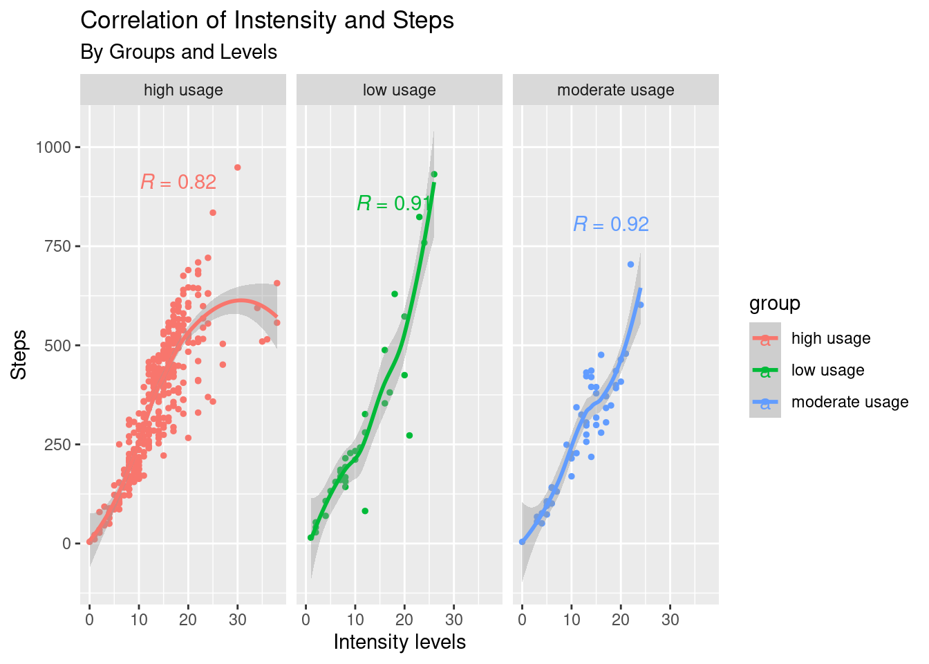
Q. How do Intensity and Distance correlate among groups?
# Scatter plot correlation between intensity/distance
ints_dist <- step_sleephour %>%
  group_by(group, id, date) %>%
  summarise(intensity = round(mean(total_intensity),0),
            distance = round(mean(total_distance),2), .groups = "drop") %>%
ggplot(aes(x= intensity, y = distance, color = group, show.legend = FALSE))+
         geom_point(size = 1)+ geom_smooth(method = 'loess', formula= y ~ x)+
  stat_cor(aes(label = ..r.label..), label.x = 10)+
  labs(x="Intensity levels" , y="Distance levels")+
  ggtitle("Comparison of Instensity and Distance", "By Groups and Levels")+
  theme(axis.title.x = element_text(size = 10, face = "bold"), axis.title.y = element_text(size = 10, face = "bold"))+
  facet_wrap(~group)
options(repr.plot.width = 14, repr.plot.height = 7)
ints_dist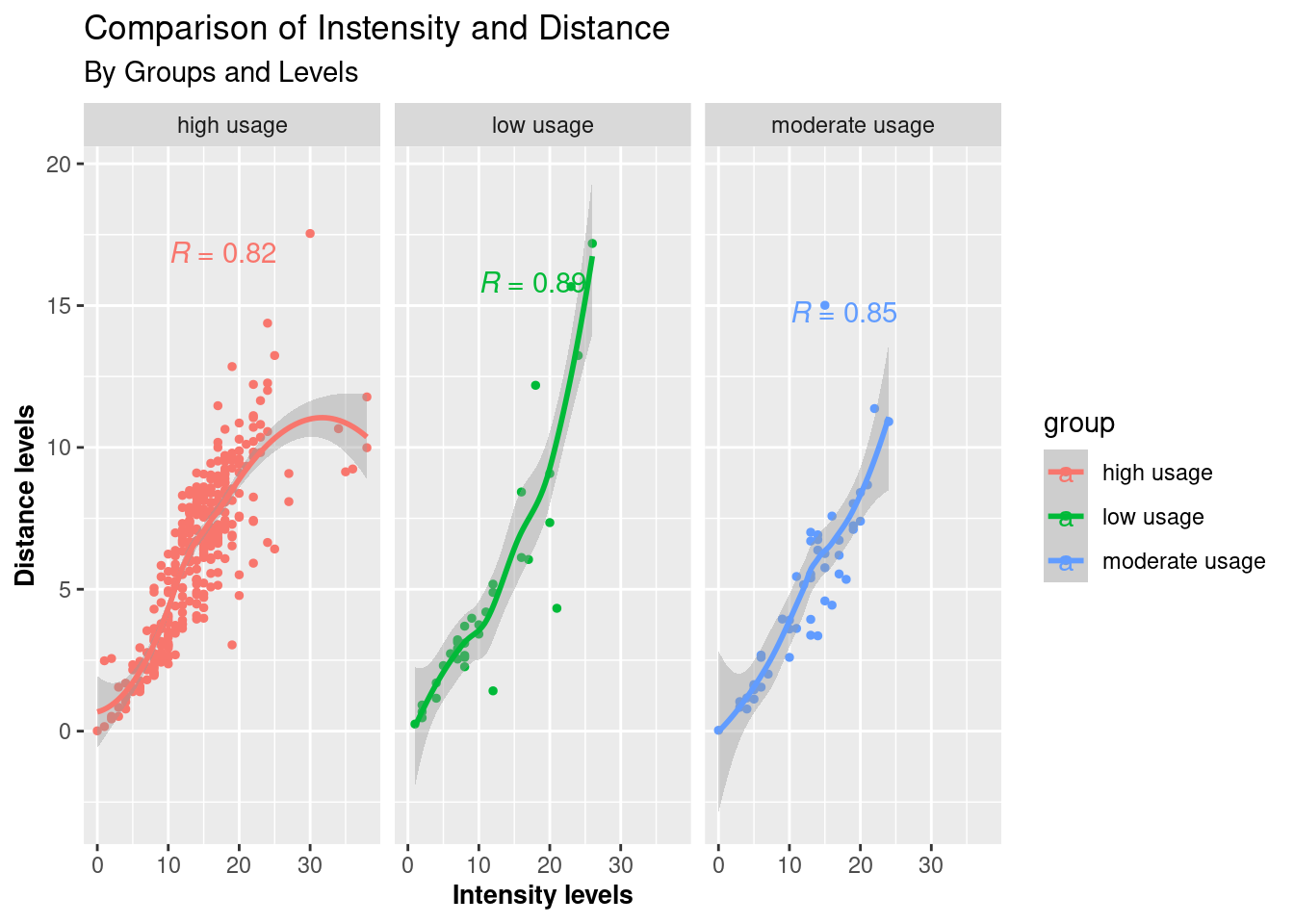
The correlograms show strong positive relations between steps walked and intensity levels and distance and intensity levels among all three groups.
The number of steps walked is greater as users increase their intensity levels, particularly for low and moderate-usage groups.
The more vigorously one performs, the different distance levels are made; this is more significant for low and moderate users.
The high usage group generally correlates less significantly with the other two in both terms.
Q. How do Steps and Calories correlate among groups?
Scatter plot correlation between Steps and Calories
# Scatter plot correlation between Steps and Calories
steps_cals <- usage_df %>%
  group_by(group, date, id) %>%
  summarise(cals = round(mean(calories),0),
            steps = round(mean(total_steps),2), .groups = "drop")

ks <- function (steps) { number_format(accuracy = 1,  scale = 1/1000,suffix = "k",big.mark = ",")(steps) }

ggplot(steps_cals, aes(x= steps, y = cals, color = group))+
         geom_point(size = 1)+ geom_smooth(method = 'loess', formula= y ~ x)+
  stat_cor(aes(label = ..r.label..), label.x = 10)+
  labs(x="Number of steps" , y="Calories burned")+
  ggtitle("Correlation of Steps and Calories", "By Groups and Levels")+
  theme(legend.position = "bottom")+
  scale_x_continuous(labels = ks)+
  facet_wrap(~group)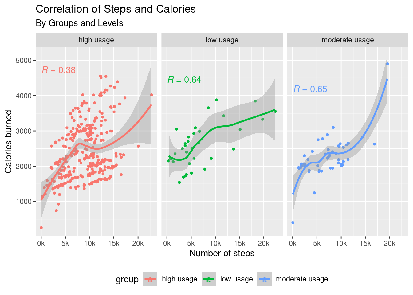
options(repr.plot.width = 14, repr.plot.height = 7)People with more frequent use of their intelligent devices show a weak correlation between calories and their steps walked.
Low and moderate groups, on the contrary, show higher correlations (though not necessarily decisive) between these two variables.
Discussion
A. Features usage:
Of a total of thirty users, 33 unique Ids (Some users may have more than just one id or device) used daily and hourly step count functions, compared to that 24 unique IDs for sleep tracking, 14 heart-rate trackings, and just only 8 of them used the device to manage their weight.
There are two questions to consider here:
What is the consumer’s primary interest in picking a fitness-focused wearable device (e.g., preference for functions)?
Is there an issue with product features and the ease of use? (i.e., syncing, integrating, charging, comfortableness).
B. Daily and hourly usage:
Given that there is no information on which users in this data sample wore fitness trackers, we know these users had used steps and sleep-tracking features. Data has revealed that most users fall into three segments based on their use of intelligent devices. They can be separated into distinct groups:
Those who regularly wear the device are keen on working towards daily goals.
Those who wear the device every few days but need to work out.
Those who use wearable fitness devices only sometimes in the period but would intensively work out when into it.
According to Fitbit.com, “Fitbit converts raw acceleration data into activity counts in 60-s sampling intervals that define activity intensities as 0 = sedentary, 1 = light PA, 2 = moderate PA, and 3 = vigorous PA”
0 = Sedentary time is likely long hours spent sitting at work or study, etc.
1 = lightly active time is time made up mostly when user briskly walks during the day (for example - work commute and in between, shopping…).
2, 3 = fairly active, very active time are likely general exercises/training depending on user’s intensity levels, time duration expected to be shorter than those two above variables.
From my analysis, we can draw some conclusions here for all user groups:
The High Usage Group (with 21 ~ 31 days of smart device usage):
Half of the users in this sample are wearing their devices almost daily OR concerned about their daily steps count and sleeping patterns AND presumably cared about keeping their data synced. These are the everyday users who generally want to hit their daily goals following a clear timing schedule.
Group’s characteristics:
(a) Frequent users of intelligent tracking devices are those who exercise. There are positive but not strong relations between the number of steps accumulated and each single intensity level. The longest active minutes were spent for this group; even a few users went an extremely high amount of busy time.
(b) Typical day/week: Light activity of 3.5 hours (such as work/school commute, brisk walking during work/study) and some 12 hours of sitting hours. They would steadily stick with their bedtime routine, have a sufficient sleep, and have longer hours of sleep/bed rest over the weekend.
(c) Exercise/Rest patterns: Frequent users have a regular exercise routine toward their daily goals. Most steps are taken between 8:00 and 20:00, with peaks around lunchtime and between 5:00-7:00 p.m. after work. This group takes steady steps across days of the week, with particularly more intense activity at the beginning of the week (Mondays and Tuesdays) and slightly more steps on Saturdays than workdays. They take the least number of steps on Sundays, which is expected as a rest day.
(d) Daily goals: This group aims at a significant number of steps and a fair number of calories burned (9,500 steps / 2,200 cals).
(e) Types of physical exercises: Users in this group burned most of their calories from vigorous activities and generated most of their steps during high or moderate-intensity workouts. The number of calories burned is not necessarily proportional to the number of steps run or walk, implicating that frequent users may have taken different forms of physical exercise.
(f) Frequent users would also keep the same intensive level throughout the week and at similar hours (especially in the evening after work as in (c)), with little to no significant difference in their intensity levels between workdays and weekends. However, they may have more hours exercising on a Saturday compared to the rest of the week.
The Moderate Usage Group(with 11 ~ 20 days of smart device usage):
A minimum proportion of users (12%) maintained *wearing their devices moderately* OR *slightly concerned about reaching their weekly goals*. They may have a somewhat similar hourly step pattern to the “keen ones” but tend to remain much less intensive, even lesser than the low-usage ones. They may work out less compared to the other two groups. Participants walked fewer steps during weekdays and compensated for the loss in steps during the weekend, with the majority of steps accumulated from light movements such as brisk walking.
Group’s characteristics:
(a)Exercise/Rest patterns: This group of users doesn’t seem to follow any particular exercise routine but steadily stuck with their bed routine and had a sufficient sleep.
(b) Typical day/week: smart devices’ moderate usage group tends to spend **most** hours in *low active* activities such as commute time and between; brisk walk, shopping etc. (4 hrs) and **least** *sitting/inactive* hours than other groups (8.7 ~ 12.7 hrs). Very lightly active during weekday evenings (around 18:00 ~ 20:00) but mostly active over the weekend. Many users would make their most efforts to exercise on a Saturday (with peaks around noon and afternoon).
(c)Daily goals: moderate number of steps and a fair number of calories burned is what this group aims at (7,300 steps / 2,200 cals).
(d)Types of physical exercises: *lightly form of activities* is a distinct factor contributing towards *number of steps accumulated* and *calories burned* for this group. More steps and calories accumulate when people take long brisk walks such as work/study commutes and shopping.
(e) Moderate usage group has a bit of an intersection of both high and low frequent user characteristics: steps are taken symmetrically by date and time across days of the week though there is no straightforward “certain hour” routine of how they would schedule their exercising activity.
The Low Usage Group(less than 10 days of smart device usage):
There is a far less than half proportion of users (38%) who are wearing their devices sometimes OR presumably not at all concerned syncing their data. They are okay with being flexible in timings and intensity. Though they do not fit into any particular schedule, they try to keep themselves moving as much as possible when doing it.
Group’s characteristics:
(a)Exercise schedule/rest routine: This group doesn’t follow any* step/hour/day* schedule nor rest/sleep patterns. On Saturday, users made the most effort, as the most steps were taken on this day. They don’t have a certain hour of intensity, though there are even a few users with extremely high amounts of active time and unusual hours when many steps are taken.
(b)A typical day: This group has a vast number of sitting / inactive hours among the three (12.5 ~ 18 hrs); sleep hours and rest hours varied the most (2-6 hrs).
(c) **Daily goals**: *a low number of steps* with *a high number of calories burned* is what the group aims at (4,900 steps / 2,500 cals).
(d) Types of physical exercises: Most steps generated from **vigorous sessions of workouts**. *Number of steps* accumulated most during *very active* sessions of exercises, whist *calories burned* most when there is an increase in *distance* travelled.
Technical issues and barriers:
At least half of users did not **keep the device on** or **wear the device** or **have tracked data** in the given period. That means 0 values in all data could be when the device was either charging, not worn, or not appropriately synced.
Limitation of data:
The sample population is relatively small. Data sets have been anonymously contributed by users, potentially from different places. Not knowing relevant information such as gender, age, location, lifestyle, or weather conditions, unfortunately, limits the scope of analysis that can be performed.
Recommendations
Increase Product Involvement
1 - Via App Communication:
Each user group may have different intentions (daily targets) and lifestyles toward their daily activities. However, the first step is owning a device and capturing the information.
One way to do this is to enhance user experiences by giving real-time feedback to users - providing regular daily (even hourly) engagement with users of each group so that they can make quick, informed decisions to optimize their routine.
2 - Via Device Integration:
Consider enhancing the product’s interaction and integration with other intelligent devices that the user may have. For example, “By making it more possible to sync all the data into the user’s smartphone, we can increase product involvement by tracking activity progress and making it worthwhile for the user.”
Device integration also means the easiness of switching from one device to another.
Niche-market To Consider
- An excellent proportion of users would wear the device daily or every few days (88%) and intensively exercise out of their nine-to-five schedule. A 2-in-1 SMARTWATCH with a jewelry-inspired design and useful health-tracking features may be a good fit for female users in the current high and low-usage groups.
- Leaf is already a good fit for the moderate ones or any users of any group who would wear it to sleep while tracking their sleep patterns.
Device’s Accuracy
Improving a product’s accuracy in measurement is crucial to any fitness device. Such features as sensors, connectivity, and charging help prevent losing meaningful data - an important point to get a consumer to understand the usefulness of the product they own and get them to act.
Further Research
Surveys to be sent out when necessary to gain a more in-depth knowledge of consumer behavior, such as:
Consumers’ primary interest in picking up a fitness-focused wearable device (e.g., preference of functions)?
Is there an issue with the ease of use of the device? i.e., syncing, integrating, charging, and comfortableness for the user to sleep on.
Is there a relation between data absence and the ease of use of product features?